Trailblazing Design Thinking in the Growth organization
Medium: Web
Responsibilities: Spearheading UX, educating stakeholders on why UX is important, how is UX relevant to the business, and getting budget
Results: 20% decrease in bounce rate, 10% increase in sessions, users, and 3% increase in page views
Headcount & resources: Went from 0-2 head counts and 100K research budget a quarter
Teams collaborated with:
Product Marketing
Content Strategy
Strategy & Ops
Web Engineering
circa 2016
Wild, wild west
When I was first hired at AppDynamics, I was told to "make the website better"; little did I know, the organization was nascent to any experience, let alone UX. "User Experience" was a foreign buzz word. People understood it was needed, but not sure why. I realized my challenge was more than the website; it is to foster an environment of design thinking. In addition to work shown here, there has been workshops conducted department wide to educate stakeholders on what is user experience and how it is relevant to the business.
No journeys, no experience
The primary function of the pages were predominantly SEO focused. There was no pathways to engage our users purposefully beyond one page. We set out to redefine how the website matches back to meet our funnel needs:
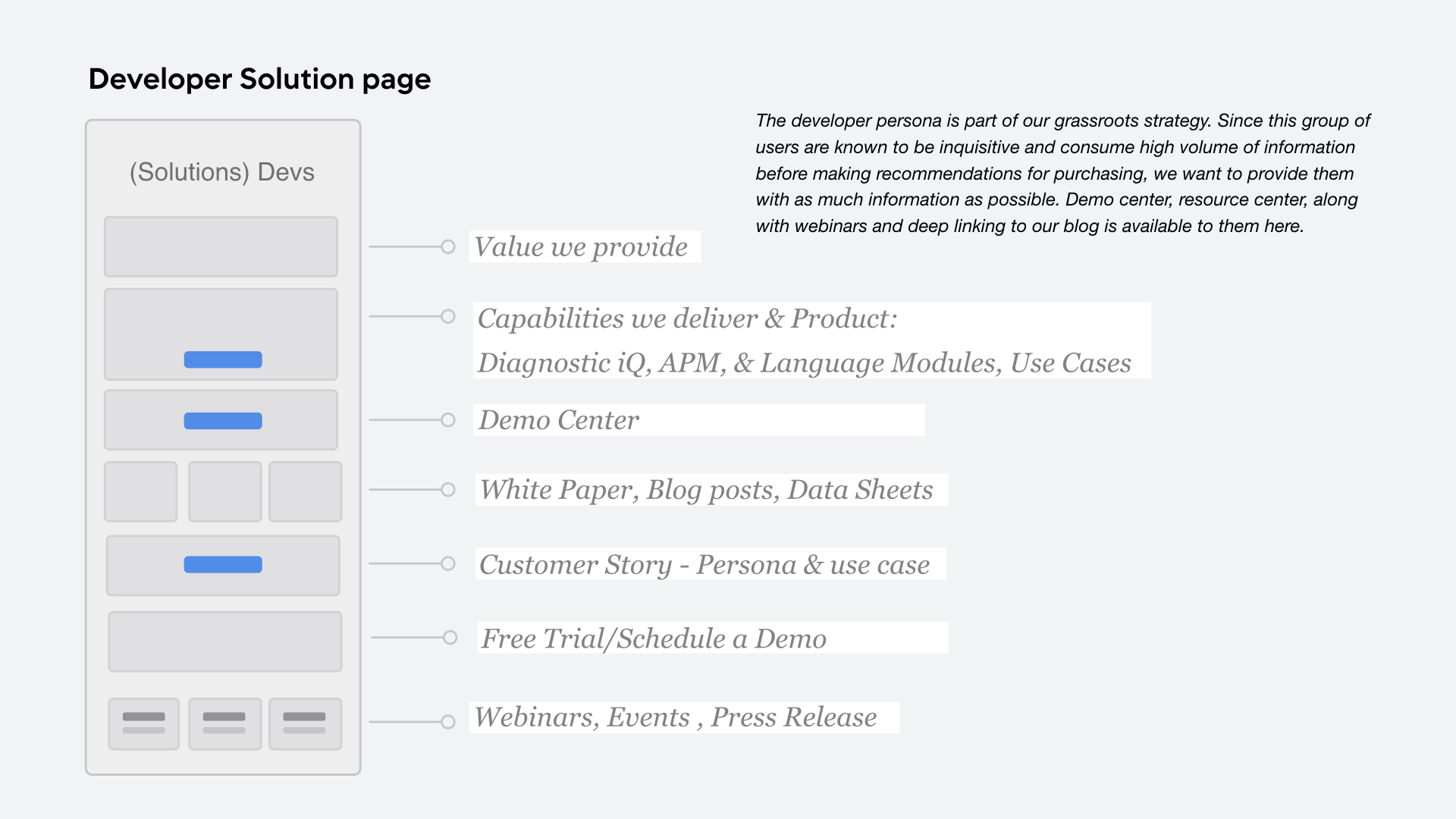
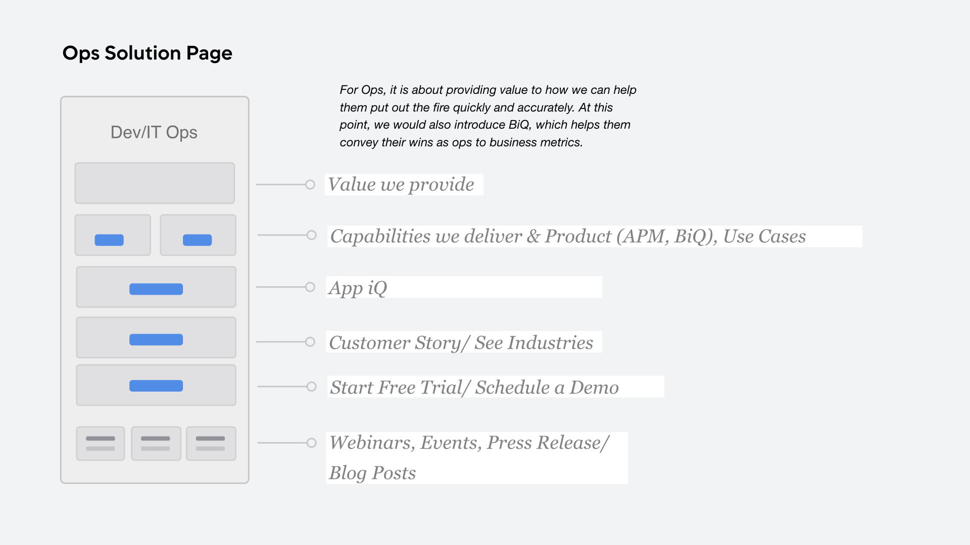
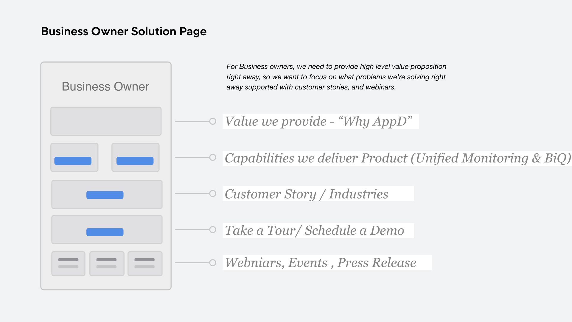
We want to create a tailored experience with our "solutions" pages for each persona with cross linking between product and solution pages:
Full Journeys
Developer Journey
Ops Journey
Business Owner Journey
Twist of fate - "Website is not on the roadmap"
There was a shift in executive focus to support Sales effort, and the website did not make it on the list. At the Summit New York event last year, I launched a survey that brought the website back:
This was presented to the CEO, and turned the ship 180. Website was back in business!
New Brand and Systems
We were then commissioned to revamp the website with a 8-week timeline, in time for our company kickoff day. We were going through rebrand and received this new preliminary visual guidelines:
New brand provided by an agency
Brand Axis
The brand axis aims to target the vast audience we have- from business owners to developers, which makes it relatable on different levels:
Brand to Web translation
I partnered with an agency on execution on assets and focused on art direction, and design system
While the axis serves well in other mediums and channels, such as print, social media, it was clear that the website will need to stick to neutral as it is a crucial touch point across all digital channels. We started to created a mood board and brainstormed on which direction it could go:
Roadblock
Because of the lack of development resources and impacted timeline, we were told we could only make changes to existing design framework. We focused instead on the design system and adding 1-2 new components.
Design System
Atomic Design System was used as a reference for our 1.0 style guide version:
Page Hierarchy
An effort was made in differentiating the types of information displayed, from high level, to content heavy:
Responsive screens:
Click through to see screens in invision
Visual assets
Strategy and Research
Since we only had about 8 weeks, we decided to concentrate on what impacted the business the most. We focused on the APM journey, which accounted for 60% of our business. Through user interviews, we validated all designs put out, and uncovered forward-looking nuggets.
Home Page
The then current home page does not present enough value proposition at first glance. We want something engaging right off the bat to encourage deeper dive.
Home Page version 1 - See it all
This is the comprehensive version, where the hypothesis is assuming glimpses into everything is wanted:
High Fidelity
Home Page version 2 - Role focused
This is the role focused version with a hypothesis that personalization works early in the funnel, while product takes a secondary place. There is also an emphasis on thought leadership and industry news towards the bottom.
High Fidelity
Home Page version 3 - Interactive is key
The hypothesis for this short home page is that people don't need a lot to further deep dive especially if it is interactive. The interactive module is the star here.
Results
We tested these 3 version with 15 people, 5 developers, 5 ops and 5 business owners over remote 45-minute interviews.
Highlights:
The platform module was very intriguing. High level of activity there.
90% of participants’ first click would be one of the roles.
The navigation bar in version 1 caught the most attention. While hamburger menu is perceived as modern when noticed, most did not notice the menu.
The slider component is seen as interesting but too abstract
Other insights include the mental modal of how they arrive at the website, and what matters to them in the next 3-5 years.
*The same rigor is applied to APM and How it works pages before launching.
Recommended Home Page
Additional Challenges
We had significant lack of development resources that prevented us from making more progress. We were also missing messaging framework that impeded content production. Lesson learned here is create small lifts that has big impacts.
What's next
Global navigation study is underway, along with brand awareness research.
Design system 1.2 is launching soon. Partnership with product experience on unifying end-to-end experience.


