Timeline: 2 weeks.
Main Responsibilities:
- User Research--Cardsorting & Interviews
- Ideation
- Sketching
- Wireframing
- Lo, Medium, & High Fidelity Mockups
- Prototyping
Background
Betabrand’s unique philosophy is to create a community of fans as their consumers—Fan-supported design through crowdfunding; fans as models—“ model citizens”. Their brand is known for their quirky, fun, high-energy, yet highly utilitarian designs (i.e. Dress Pants Sweatpants).
There are 4 aspects that make up their community:
Clothing + Crowdfunding + Design + Model Citizen.
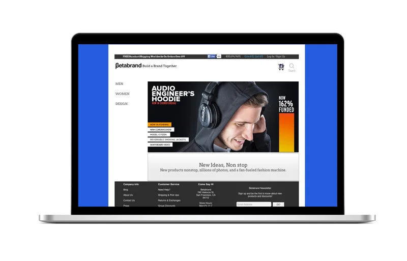
Unfortunately, the quirky business brand also translated into the experience of their site:

The layout of the home page is confusing:

All items are displayed on home screen
When a user is greeted with all products at first glance, the experience can be disorienting as there is no guidance for what to look at.

The categories are lacking a gender filter.
Since Betabrand carries both men and women's clothing items, it is important to have a gender filter to organize as well as create different shopping experiences.

Seeing each individual item like a poster is overwhelming.
I ran a test for users to look at big picture thumbnails for landscape and for clothing items. For the clothing website, 90% cannot continue shopping after about 2 mins, while people could keep browsing landscape pictures well after 5 mins.
The feedback for the clothing website was the large thumbnails were distracting, and not quite helpful in terms of making purchasing decisions. The interesting photography angles pull away from the fit, quality, materials, and cut of the product, leaving shoppers confused.
Same items appearing twice, only increases the level of frustration:

Same item appearing twice in different colors.
Challenge
How do I redesign the website without compromising the spirit of Betabrand?
Solution
The content and spirit can be delivered through the pictures. However the shopping experience must be familiar to be deemed trustworthy by shoppers.
Redesigning Shopping Experience
With that in mind, I performed 2 rounds of cart-sorting to find out how people organize their clothes.
Majority of people organize clothes by items: pants, jackets, shirts..etc
I also wanted to see what people thought of their collection names in relation to clothes.
2. Have people organize clothes according to their collection names—VagiLab, Sons of Britches, Cordarounds…etc.
*People took TWICE as long to categorize items according to collection names. Some found the names irrelevant to clothes.
Although name of collections is something that I can’t change, I can organize it so people will understand that those are the names of collections.
To improve the web experience, I needed to work on the navigation and information architecture.
Home Page

Playing around with a tagline: “backing designers to back you.”

Since men and women shop differently, I wanted to curate specifically to each one by creating separate pathways.
Designers will be looking to submit their designs for Betabrand. Hence, another different portal was a created for a different experience.


Updated tagline—-omitted “let’s” from original for an imperative tone.
A navigation bar placed on top to make the point-of-entry clearer.
I placed the design entrance side-by-side with men and women for equal hierarchy.


Navigation seems to crowded.
- Added images to see how it looks.
- Too many images on the page can be distracting.
- Images’ layout feels like advertisement.

- A side navigation bar that will not get in the way of blocking the hero image with possible drop-down menu.
- Social media icons moved to the footer instead.
With the design of the homepage set, the rest of the pages become easier to design.
Men's Page
While I conducted the card sorting exercise, one of my users was O.C.D. about organization. As we got to talking, she made the suggestion of organizing the clothes not by item but by filters--e.g. popular, latest, newest...etc. That got me thinking, and I did a round of testing with that idea. People loved that idea, although there was a little bit of an adjustment to not seeing clothes classified by items.
I decided to highlight clothes via different categories while keeping the item classification:

I tested 6 different types of categories:
- Popular
- New Arrivals
- Vote
- Sale
- Outfits
- Crowdfunding
After testing, the categories were narrowed down to four:
- Popular
- Outfits
- Sale
- Vote/Crowdfunding
The Vote & Crowdfunding categories were combined into one as they are part of the same process--To get to the crowdfunding stage, the items have to have enough votes. Outfits is a category that they currently don't have, but would be good to include as people are interested in having a "lookbook" for suggestions.


The general categories as navigation for men's section.

The final "lookbook" components.
The next flow that is key to a great shopping experience is the checkout flow. Current checkout processes for most websites is time consuming. It usually involves filling out multiple pages, which adds to the illusion of a lengthy process. I thought it would be better if there is a way to checkout with by filling out all the information needed on one page.


Shipping Address, Billing Address and Payment Method are all available at a glance. New address can be inputed when the"add" button is clicked.
"Create Login" is usually an additional step, but in this case, this option is immediately available after the entering of the user's information.

Delete function is added for the ease of editing the cart for any last minute changes.
Feedback & Next Steps
The new website was brought into Betabrand store for a test run, and people loved the new setup. One thing that they kept saying repeatedly was how easy it was for them to find what they were looking for. They were also really looking forward to seeing the "Rad Outfit" section.
Checkout process was in favor with them. They liked how they are able to input and see their information all at the same place. They particularly liked how they can create a login by only creating a username and password without the hassle of re-entering billing and shipping information.
Betabrand is looking to expand their womens' line. The next steps would be to build out a flow that specifically caters to the way women shop, creating a wholesome Betabrand web experience.