Redesigning the digital experience of the largest SaaS conference.
Number of Designer: 1
Scope: 2,000 sessions in 4 days
Reach: Over 150,000 attendees
Platforms (Mobile First): IOS, Android, Apple Watch & Web Responsive Platforms
circa 2015
Challenge
Dreamforce offers over 2,000 sessions in just 4 days, spanning over 3 blocks of San Francisco's downtown. How do we ensure attendees the full advantage of our offerings without overwhelming them?
Where We Were In 2014 (IOS Native App)

Dense screens
Needed more Dreamforce spirit
Focused on functions over the journey
Vision

Competitive Analysis
While we looked at many other tech events and conferences, nothing really has the scope of the Dreamforce event, which makes this a unique problem.


Navigation
A location display and a session-to-session navigation.


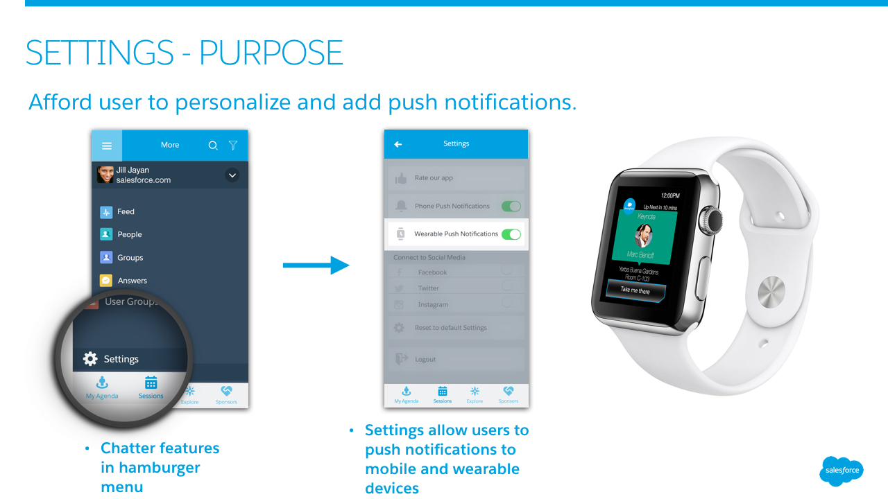
Personalization
Flitered List view set according to personal preferences.


Discovery
Discover what is around you on Dreamforce campus.


Everything at your fingertips
With the Apple Watch platform, the users now have the ability to view what's coming up next with directions one tap away.
Prototype
A prototype that walks through the "My Agenda" and "Sessions" experience:
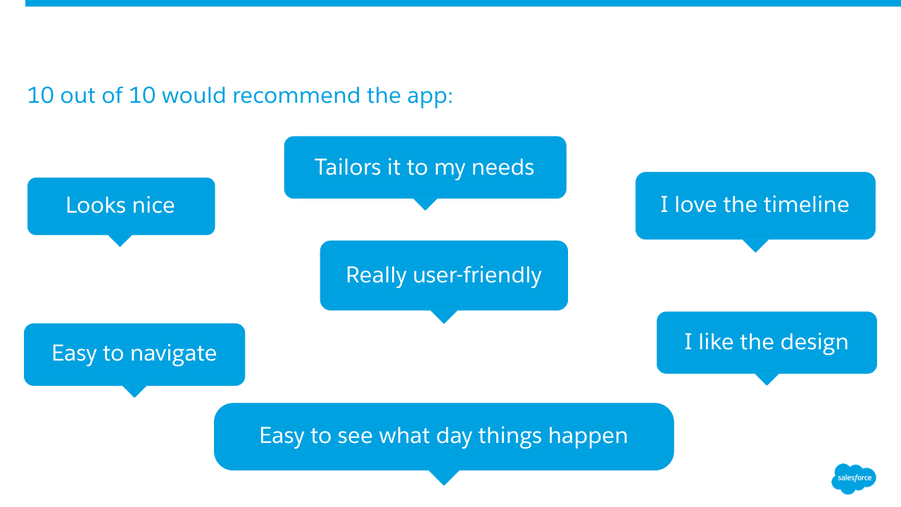
User Validation
We were very excited to conduct a usability test for the first time in the history of the Dreamforce app. We tested the prototype with past year attendees as well as frequent conference goers. Here is what they have to say: